Thursday 9 December 2010

Final Renders

At first I had a lot of difficulty getting this right. Textures for some unknown reason were not showing, instead they'd be rendered black. Nevertheless I countered this by changing the file type from jpeg to bmp, and all was sorted. The textures after this worked perfectly fine and I was able to continue my work.


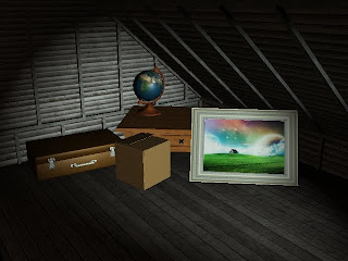
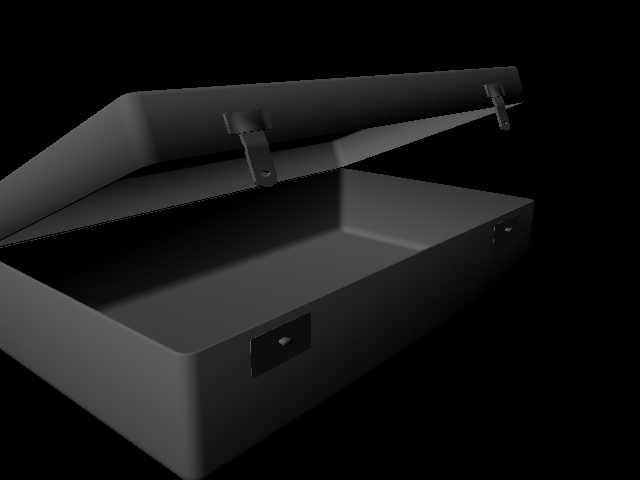
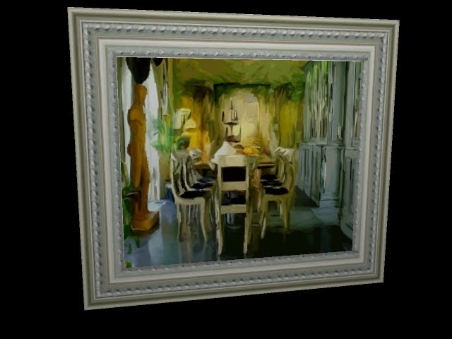
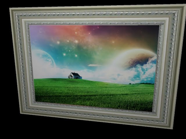
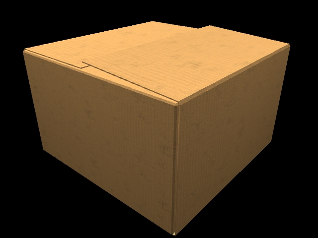
This is the first render, where the objects appear new. The globe and the suitcase both act on the light and reflect. this is because the globe is a plastic material, so it would naturally have some glossiness. Same goes for the leather. Of course the wooden table and cardboard box are not, so they were Lamberts naturally. The painting is old anyway, most painting in houses are, that is why I didn't allow it to reflect, I left it as it is.


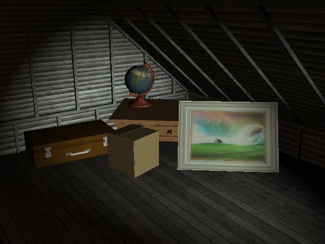
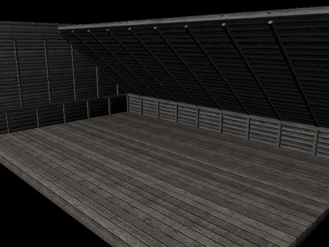
Now the objects have discoloured over time and aged. It is apparent that they have been there for some time. The lights were exactly the same, so they have no effect over the objects here. I had thought about altering the lights, to exaggerate the ageing process they would have taken. But then it would seem that I could have just done that in the first place. Though of course without the same effect as actually changing the object. I wanted to fully show how the objects here had changed. Therefore, the lights stayed the same.


I had though about having several renders showing the progression of objects placed in the attic, but I thought it would have been more simple to have all objects in the attic together, before and after. Otherwise, the way I would've gone about it, it would've been better to make a video. I had initially intended to make a video however, but I wanted to focus more on the modelling and texturing, spending all my time on that.

Placing the assets in the attic


I have situated my objects in the the attic scene, and placed them in the corner of the room. I know attics are usually either packed or very untidy but I only had a few objects and I needed to separate them in order for them to be seen clearly for the camera.


This is the same scene, but with the old looking assets. Exactly the same except they either have different textures or different nodes, or both.


I created a plane and made a hole using a cube and Boolean to simulate a window. I tried to replicate the moonlight shining through the window. I did not accurately create this, but I am not specialising in lighting and my aim was only to light the objects in my scene. I used a spotlight for this and gave it a slight tint of light blue.

I also added a point light, with a brown tint, to make the walls and floor look less dull and grey. It shows too, the colour helps.


Wednesday 8 December 2010

Assets Comparison - Aged


Here is the comparison between all my assets, old and new. Ultimately, I have either added a coloured layer with low/half the opacity in Photoshop, changed the node, or changed the actual texture. With the painting though, I created some discolouration on the edges, it actually brings forth the frame too, which is quite nice, looks a lot less flat.

The table and box only had a coloured layer over them, same with the painting, beside the aforementioned discolouration. The globe had this also, but the stand on which it sits has a new texture; a similar, but darker, and slightly redder one. It gives the impression it has discoloured over time. The suitcase was just a simple change of the node, from Blinn to Lambert, as mentioned in the previous post.

Suitcase Comparison

I duplicated the suitcase, created a Lambert node and assigned the texture to this new node. Before I did not realise I could assign textures to multiple nodes. It proved quite useful and made my Hypershade Work Area a lot more cleaner to work with.

The one on the right is Blinn, the left is the new Lambert model. Already there are differences between them both. The Blinn model has a line of light running along the front edge and the top overall glows a little more than the Lambert model, which is plain all over.


I added a point light in the scene, getting a better perspective of the comparison between both models. There is a vast difference now. The Lambert model remains as dull as before, but the Blinn model recognises the light much more now. There is even a thin streak on the handle. It looks more like leather now as well, it has a nice shine to it.


This is the screen capture I took of my Hypershade window showing the files assigned to multiple nodes. I did it with all four textures for this scene. It proved very useful and saved filling the work area with too many files and nodes, etc.

Suitcase Textured

It is now textured and it is looking far better than the previous model would have looked. The clips look relatively okay, and although the handle does not rotate, it is still acceptable. Though perhaps in the final scene, I will change the colour of it to light brown, to match the rest of the suitcase.
The Clips and the parts the handle are attached to have scratched metal textures on them. The two pieces attached the the bottom however, also have screws textured on them. They are slightly noticeable.
I believe this to be a decent model.

Suitcase Remodelling

I had enough with the previous model, and created a new one, proving much easier to model. I had followed the basics from this image with the red suitcases, but made it more of my own. So I basically kept the original size of it.


I first modelled the bottom part simple enough, then duplicated and rotated it to sit on top of the bottom part. Both were bevelled.

Then I began modelling the clips that fasten the suitcase. I used boolean on the vertical piece, though really, it is not even noticeable in this render, nor will it be in the final render, but I wanted to be in control of my model, so that it worked okay.


Just the suitcase opened, to get more of an understanding of how it look from different angles. I didn't bother to make the hinges on the back as they will not be seen on camera, it was unnecessary to model them.


This is the final suitcase before texturing. The handle has been added. Not perfect, but it will have to suffice.

Suitcase

I tried to model a suitcase from this image, though it went horribly wrong. I had tried modelling it as one whole object rather than two separate ones; the top and the half. The textures weren't half bad either, though the darker one was not tiled, so would have looked very odd, as you can see on the side of the suitcase in the render.


Attic Lighting


I added a light into the scene, helping to change the dullness of the attic. In the final take, I will add a wall, and have the light shine through a window, as if it were moonlight shining through.


I've taken another render of the corner, get a better understanding of how my assets will look once in place.

Attic Remodelling


I have recreated the attic, as I though it would make it look more 3D if I used 3 dimensional objects rather than planes. I bevelled the cubes to round off the edges to give it a form, rather than it just being like a texture was slapped onto it.


I did this with the walls as well. I'd bevelled everything the same. I had the offset to 0.200, and had 2 segments.


Now I have added the pieces of wood again that'll hold the attic. I have followed the original image a little more thoroughly than before. their texture is separate from the wall and the floor, I'd given it a grey coloured wood texture. Though the attic looks very grey still anyway.


An angle away from the corner, so to see the whole thing. I chose not to add the other two walls, they were pointless as I will not be using them. It makes it easier for my to set up cameras also, I am not as limited as I was before. However I will have to be careful not to catch the ends of the wall or ceiling in the camera's shot.

Monday 6 December 2010

Nodes - Phong, Lambert, Anisotropic and Blinn

This is a comparison of the nodes within Maya. It was to understand nodes more, I used four bowls for this. I added a light above and a low intesity light below.

Phong should be useful for glasses, as when in light, there tends to be spots of glare, the light appears to be more concentrated in one area. this appears in certain plastics too, and ceramics, but only in light of course.,

Anisotropic is most luminescent of the four here. Blinn in comparison reflects less light therefore allows more detail to show through. The brightness in Anisotropic is quite dense, it'd be best used somewhere with extreme light.

Blinn, although similar to Phong, will likely be in direct sunlight, or near a room light. The light doesn't focus in as much on one area like it does with Phong. I would say Blinn is good for water, it is strong and it spreads the light across the surface.

Lambert is the dullest of the lot. It looks like it's old and/or matte in colour. Wood for example would be suitable for this node. Dirty objects also will be best fit for Lambert as the layer of dirt in whatever object it is will prevent reflection from the light source. Cardboard is also effective.

I am still learning more about nodes and which materials they best fit in a real world environment.

More Water Experiments

I had another attempt at creating water in Maya, following the same tutorial, but with a different texture. Again, however, this looks a little too much like snow.


But from a close-up it looks a lot more like water, as it appears more reflective and the form it has taken.


I added a bump map and it turned out like this, it is horrible and looks like a dirty wall.


But I altered the setting and made it look more natural and an improvement. Though it looks more like snow again. The bump map has taken away the reflective nature of the water though.


Before I had been working with 35x35 sub-divisions. I took them away and worked with one polygon only, as an experiment, too see how it would look. this was the result. It looks far more like snow than I had created before. Something I believe noteworthy if I need to create snow.


Again, another little experiment, adding a different texture and with a bump map. I don't believe bump maps work well with successfully trying to create water, sticking to displacement maps work best.

Sunday 5 December 2010

Attic with Assets


I added the other assets in my attic, to see what it would look like, so I placed them in the corner to see if they sat well in the scene. They look out of place, the objects' colour is too bright for the attic.


I added a light and coloured it black to help darken the room and help make the objects fir in more nicely within the attic. It is slightly better, but I reckon with a different texture on the attic, it will help bring the whole scene together.

Attic Modelling


I used this image here as reference for my attic scene. I am only using one corner of the room also, so no need to spend so much time making it all look good.


Here is the start of the modelling. I have added the pieces vertical and horizontal, shown here in grey. They are textured, but with a grey wood texture. I do like the wall texture however it does not match the flooring. I decided to use a texture similar to one in the reference image above.


This is the texture I found on cgtextures.com. I'd changed the flooring as well, again similar to the floor in the first image. It does look very grey though. I like it because it represents the dullness of an attic. But it just lacks so much colour. I may go back and alter the textures with some more colour, or perhaps add a coloured light into the scene.


This is the attic, fully modelled. Yet there are still concerns with where the wall and floor just 'meet'. I am yet to fix this problem, but will do soon. The vertical pieces of wood are aligned here, that will need to be changed as that is not the case in the reference image. But overall I am satisfied with it, though just need to improve upon it.

Attic Testing


I began modelling the attic and was figuring out which textures to use, so I was having a bit of experimentation. The wooden plank texture from before, I used again. The floor is the same texture also, but I added a light brown layer in Photoshop. It's only slightly noticeable though.


I closed of the room, and ridden myself of the first flooring texture. the new floor does not match or even look similar to the wall, which is bad, then everything will look out of place.


In the end I used the wall texture on the floor. But where the floor meets the wall needs to be sorted, it does nothing, it just meets and crosses each other. there should at least be a slight gap, however small. I will take this into consideration for the final piece.

Painting


I found a painting frame easily enough on Google Images. I mapped it onto and Plane and used the Insert Edge Loop Tool and created sub-divisions to genereate one huge square in the centre of the plane. then I unwrapped the frame texture to the outline of the plane.


I gathered another image of a painting online and applied it to the centre face. This was the result. There was no bump mapping, and it was only a quick test, seeing if I could easily manage to model a painting for my final scene.


I tried using a picture with a different scale, and easy enough all I did was scale the entire object so that the picture inside didn't look squashed within the frame.

Plywood Flooring


I was testing this to see if I could use it in the attic scene, and I was using a cylinder again as reference to a human. After making this I don't believe that I'd like this Plywood to be in the scene. Floor boards would be a lot more appropriate.


A close-up with another bump map added to it. I still does not make is suitable for the attic scene I believe.

Globe


This is the globe I will likely be using in my final piece. I modelled it after the globe here. My texture of Earth though, not a representation of Earth, which is how Globes tend to usually be. nevertheless, it still works fine.


This is the same model, but with less polygons, and it is pretty much exactly the same as before. Therefore, I am saving myself polygons and rendering time, but still getting the same effect.


I chose to texture the base with wood, rather than plastic. I chose two textures that were suitable, and I think I could use them both. When I begin to age my objects, I can simply switch the texture from the one on the right, to the one on the left, to show it's aged/gotten dirty and dusty.
However, I am yet to use the UV Texture Editor to scale these textures to how I want them.

Cardboard Box


Just a simple cardboard box I made. At firs I created the box but was unsure how to create the overlapping folds of the box. So I made a plane that surrounded the box and made each end folds on top of the box, covering the non-existent folds underneath.
the same texture is applied all over the box though. It is not bad, but could be better, with a different texture perhaps.