Wednesday, 8 December 2010

Attic Lighting


I added a light into the scene, helping to change the dullness of the attic. In the final take, I will add a wall, and have the light shine through a window, as if it were moonlight shining through.


I've taken another render of the corner, get a better understanding of how my assets will look once in place.

Attic Remodelling


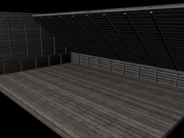
I have recreated the attic, as I though it would make it look more 3D if I used 3 dimensional objects rather than planes. I bevelled the cubes to round off the edges to give it a form, rather than it just being like a texture was slapped onto it.


I did this with the walls as well. I'd bevelled everything the same. I had the offset to 0.200, and had 2 segments.


Now I have added the pieces of wood again that'll hold the attic. I have followed the original image a little more thoroughly than before. their texture is separate from the wall and the floor, I'd given it a grey coloured wood texture. Though the attic looks very grey still anyway.


An angle away from the corner, so to see the whole thing. I chose not to add the other two walls, they were pointless as I will not be using them. It makes it easier for my to set up cameras also, I am not as limited as I was before. However I will have to be careful not to catch the ends of the wall or ceiling in the camera's shot.

Monday, 6 December 2010

Nodes - Phong, Lambert, Anisotropic and Blinn

This is a comparison of the nodes within Maya. It was to understand nodes more, I used four bowls for this. I added a light above and a low intesity light below.

Phong should be useful for glasses, as when in light, there tends to be spots of glare, the light appears to be more concentrated in one area. this appears in certain plastics too, and ceramics, but only in light of course.,

Anisotropic is most luminescent of the four here. Blinn in comparison reflects less light therefore allows more detail to show through. The brightness in Anisotropic is quite dense, it'd be best used somewhere with extreme light.

Blinn, although similar to Phong, will likely be in direct sunlight, or near a room light. The light doesn't focus in as much on one area like it does with Phong. I would say Blinn is good for water, it is strong and it spreads the light across the surface.

Lambert is the dullest of the lot. It looks like it's old and/or matte in colour. Wood for example would be suitable for this node. Dirty objects also will be best fit for Lambert as the layer of dirt in whatever object it is will prevent reflection from the light source. Cardboard is also effective.

I am still learning more about nodes and which materials they best fit in a real world environment.

More Water Experiments

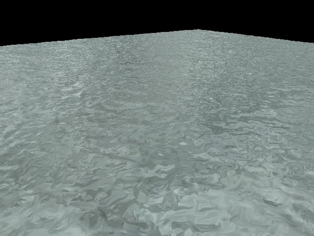
I had another attempt at creating water in Maya, following the same tutorial, but with a different texture. Again, however, this looks a little too much like snow.


But from a close-up it looks a lot more like water, as it appears more reflective and the form it has taken.


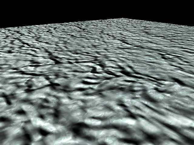
I added a bump map and it turned out like this, it is horrible and looks like a dirty wall.


But I altered the setting and made it look more natural and an improvement. Though it looks more like snow again. The bump map has taken away the reflective nature of the water though.


Before I had been working with 35x35 sub-divisions. I took them away and worked with one polygon only, as an experiment, too see how it would look. this was the result. It looks far more like snow than I had created before. Something I believe noteworthy if I need to create snow.


Again, another little experiment, adding a different texture and with a bump map. I don't believe bump maps work well with successfully trying to create water, sticking to displacement maps work best.

Sunday, 5 December 2010

Attic with Assets


I added the other assets in my attic, to see what it would look like, so I placed them in the corner to see if they sat well in the scene. They look out of place, the objects' colour is too bright for the attic.


I added a light and coloured it black to help darken the room and help make the objects fir in more nicely within the attic. It is slightly better, but I reckon with a different texture on the attic, it will help bring the whole scene together.

Attic Modelling


I used this image here as reference for my attic scene. I am only using one corner of the room also, so no need to spend so much time making it all look good.


Here is the start of the modelling. I have added the pieces vertical and horizontal, shown here in grey. They are textured, but with a grey wood texture. I do like the wall texture however it does not match the flooring. I decided to use a texture similar to one in the reference image above.


This is the texture I found on cgtextures.com. I'd changed the flooring as well, again similar to the floor in the first image. It does look very grey though. I like it because it represents the dullness of an attic. But it just lacks so much colour. I may go back and alter the textures with some more colour, or perhaps add a coloured light into the scene.


This is the attic, fully modelled. Yet there are still concerns with where the wall and floor just 'meet'. I am yet to fix this problem, but will do soon. The vertical pieces of wood are aligned here, that will need to be changed as that is not the case in the reference image. But overall I am satisfied with it, though just need to improve upon it.

Attic Testing


I began modelling the attic and was figuring out which textures to use, so I was having a bit of experimentation. The wooden plank texture from before, I used again. The floor is the same texture also, but I added a light brown layer in Photoshop. It's only slightly noticeable though.


I closed of the room, and ridden myself of the first flooring texture. the new floor does not match or even look similar to the wall, which is bad, then everything will look out of place.


In the end I used the wall texture on the floor. But where the floor meets the wall needs to be sorted, it does nothing, it just meets and crosses each other. there should at least be a slight gap, however small. I will take this into consideration for the final piece.